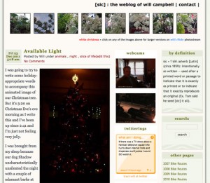
I’ve gone with a slightly different look and layout for the blog, down to a strict two-column format from its previous three.
It might look familiar to anyone out there who’s been reading me for a while. This “new” WordPress theme was one I’d used before — right up until the strange day a couple years ago when it mysteriously vanished and left the blog looking like a Web v1.0 site… all bullet points and text.
Try as I might to reactivate it, it just wouldn’t take (I still have no clue why) and so the recourse that was the least time consuming then was to reactivate the dormant three-column span, which itself was something of a miracle in that I’d somehow figured out how to shoehorn that third column in.
 It seemed like a great idea at the time, but when I brought it back a couple years ago in desperation, I never really liked the clutter or how much smaller I had to run images (400 pixels wide versus 550 now) in the posts. I also was never really thrilled with running that Flickr app of thumbnails in the header as opposed to a single image that I can interchange whenever I want.
I experimented with a couple snazzier themes, replete with slideshows and featured images and dropdown menus and various widgetry, but they were higher-maintenance and more complex than that with which I wanted to be bothered.
So anyway, that’s what new. Or what’s old that’s new. At least until it up and vanishes again.
 Follow