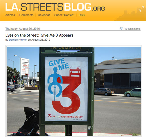
Earlier this week, our bike-friendly mayor helped unveil a new public awareness campaign a few months in the making long before Villaraigosa suddenly found it fit to champion bicycling as a viable commute form. The end-result of the campaign is a poster to be installed in a couple hundred locations throughout the city urging motorists to put a minimum of three feet between their vehicles and any cyclists they pass on the street. The screengrab above from LA Streetsblog shows a photo that documents one of the first of the signs found actually installed out there in the gridscape.
Sure looks pretty, doesn’t it?
But there’s one problem, and it’s a facepalm doozy in the form of good intentions badly executed. Of the three sides available on the triangular display, the poster’s been placed in the side that leaves it entirely invisible to motorists, the very people for whom its effective message of safety is meant.
“But Will,” you might think of asking, “couldn’t it be that the other two sides show the same poster?”
While that would be nice and ideal, as I understand it that’s not the case. The other two street-facing sides of the display offer different ads.
“But Will,” you then might think of asking, “surely this isn’t the case with e-v-e-r-y installation of the poster?”
I certainly hope not, but I’ve read in the comments to that post on LA Streetsblog that others have been found mounted in three-sided displays with the same street-blind placement.

 Follow